13 ways to optimize your website footer

Your website footer is more important than you might think. When a page first loads, the user takes in the visible content. This content that is “above the fold” should include crucial information about your brand and the problems you solve. But at some point, many users will also scroll to the very bottom of the page in search of additional information.
Both the top and bottom of your pages see heavy traffic, so the purpose of the footer is to provide users with important information that they can access on any page of your website.
How to make a good footer
It’s important to view footers through a strategic lens. There are many elements that can be included, but not all will add value to your website, and including too many can make it hard for the user to find what they need.
Let’s take a look at some common components of web page footers and discuss when and how they add value.
13 tips for web page footer design
1. Navigation
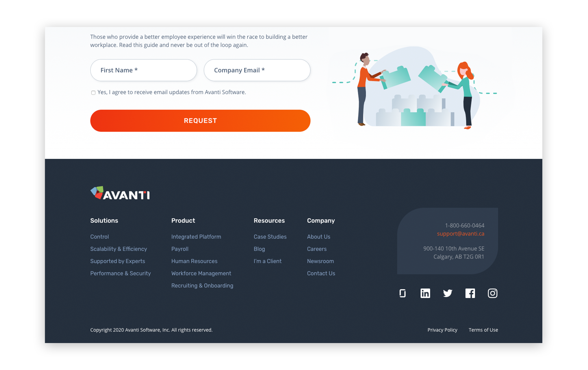
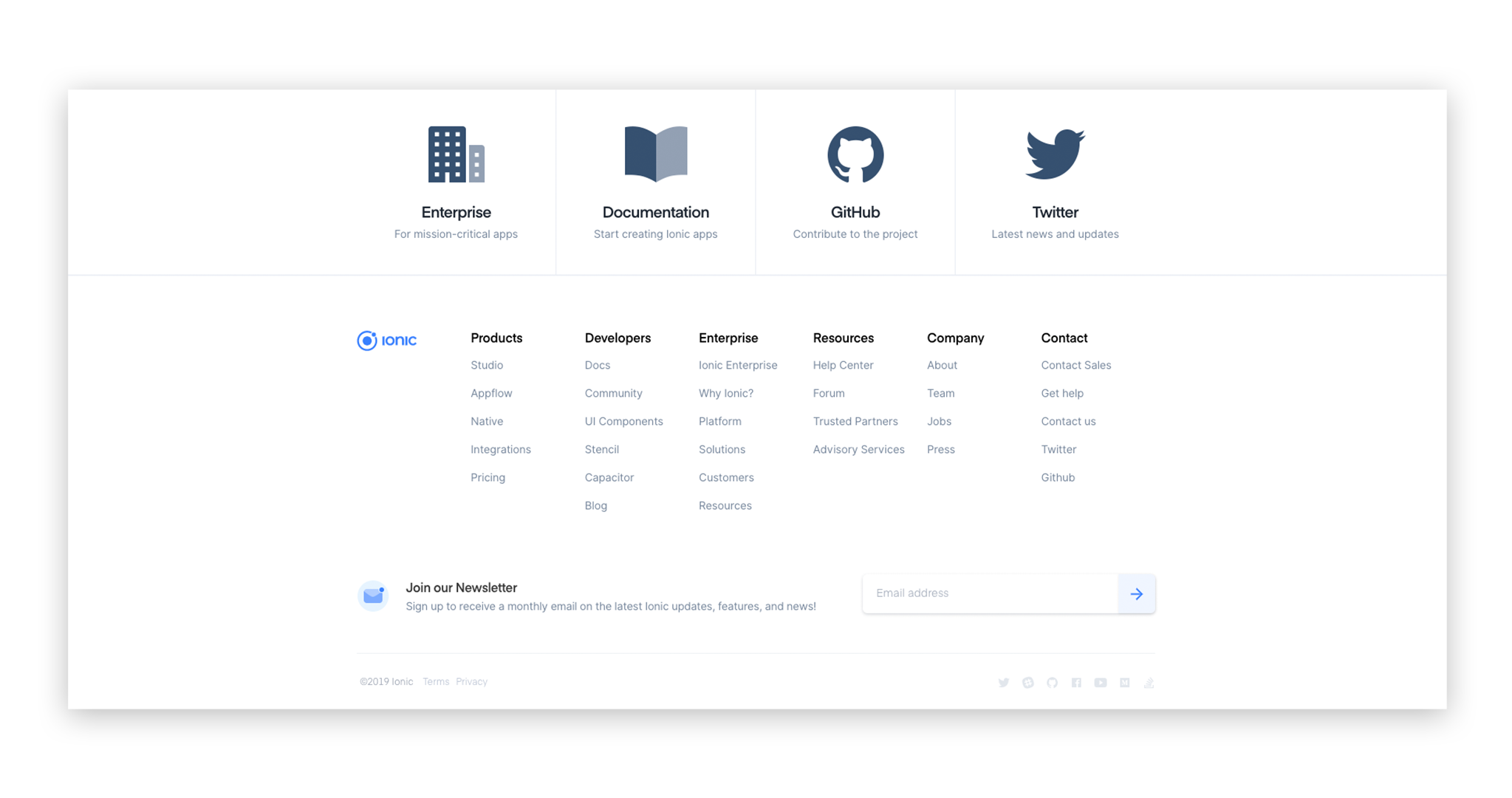
Your footer doesn’t need to be a carbon copy of the primary navigation, but it may be beneficial to include key content as an additional option for quick access.
Some websites take the approach of including a large portion of the site plan in their footer. This is referred to as a “fat footer”. Beefing up your footer does have the potential to increase conversion rates, but only if you provide the user with relevant information that improves site navigation. Conversely, an excess of irrelevant content may overwhelm the user and dissuade them from reading the footer at all.
Note that footer navigation is not necessary for mobile design as the standard practice is for mobile to have a “sticky header” that is visible as you swipe down the page.
If you’re unsure what content your users might be missing, consider assessing traffic patterns through heat mapping (e.g. Hotjar, CrazyEgg). And for further data, consider conducting A/B testing with additional footer navigation and then evaluate changes in user engagement. For more information on this and other tips to maximize your website’s impact, check out our post on web design best practices.
2. Calls-to-action

The call-to-action (CTA) is a specific prompt for a user to take a desired step (e.g. book a call, get a proposal, etc.). It drives conversions. Since users often view footer content, you should consider putting a CTA there. Just make sure it’s obvious and attracts their attention.
At Tiller, we typically place a large, attractive CTA band directly above the footer, rather than within it. This means that it is visible when the user scrolls to the bottom of the page, but it’s not actually constrained within the footer. This provides more opportunity to draw the user’s attention and also gives room to include conversion focused messaging.
3. Email signups and subscriptions
If you have a blog or newsletter, including an email signup in your footer provides an opportunity for your users to sign up for your content on every page.
Keep in mind that signups are usually most effective when paired with the actual content the user is signing up for. In other words, if you have a page dedicated to blog posts, the signup should be prominently placed within that page, not just in the footer.
4. Social media buttons
Social media icons (Facebook, LinkedIn, Twitter, etc.), provide users with convenient access to your social content which can increase brand awareness and consumer/audience engagement.
Companies that produce a steady stream of social media content may opt for integrating widgets that will display the most recent post or tweet. Carefully consider whether you generate enough content to warrant this as displaying outdated content may negatively affect your brand.
5. Contact information
Make it easy for users to get in touch with you. Although your site should have a complete contact form where users submit their contact information, some may prefer to contact you directly through email. Consider using a general contact address such as “opportunities” or “info”.
If you include your phone number or email address they should be responsive and automatically initiate a call or email draft.
If your business benefits from foot traffic, you should also include the physical address of your location(s). Consider using Google Maps’ API to allow the user to access your location directly on your site. For more information on API’s and how they can enhance your build, check out this article.
6. Copyright notice
Every website should include a copyright notice in the site footer, be it the word “copyright” or the copyright symbol, paired with the year of publication or the year substantial changes were made. Since websites are updated regularly, it is common practice to code the date such that it automatically updates annually.
Note that including copyright notice is not legally mandated (your work is protected under copyright law the moment it’s created), but the notice acts as a deterrent to plagiarism and may help your case in the event legal action is required.
7. Privacy policy
Privacy policies inform users of the data you are collecting on your site (e.g. usage, cookies, personal contact information, etc.) as well as how you will be using it.
The privacy policy is a legal requirement, but it’s also an opportunity to build a user’s trust in your website. Make it clear and easy to understand.
8. Terms of use
This should not be confused with the privacy policy. Terms of use inform the user what they are agreeing to by using your website – e.g. not using your content without consent. It’s a good idea to state that your company is not responsible for linked content on independent party websites.
9. Site search tools
Search is a complex functionality, so it should only be used when deemed necessary and the build quality permits. A poorly functioning search tool may be worse than not having one in the first place.
Certain organizations (think universities or research groups) often have a high volume of content that can make it challenging for users to navigate content. In these cases, adding a site search tool in the header and footer makes sense.
But for smaller businesses with less complex websites, a search bar may crowd the footer without adding value. Instead, assess your need for a content specific search tool. For example, on a page dedicated to blog posts, a search bar saves the user from scrolling to find their desired content.
10. Mission statement
For businesses or organizations that appeal to users with similar values (e.g. religious or political organizations, non-profits, etc.), including a mission statement in the footer provides the user with another opportunity to connect with the brand. However it may not be of high value for everyone. But regardless of industry, your mission (solving the user’s problem), should be clear throughout your site.
11. Colour scheme and branding
As with all areas on your site, your footer should be consistent with your brand identity design.
A common footer design strategy is to invert text colour. So if your body text is black text on a light background, your footer would be white text on a dark background. This change helps reinforce that the user is in fact at the bottom of the page.
Regarding logos – it can be to your benefit to include your logo in the footer, especially if you are a new or recently rebranded company trying to increase brand awareness and familiarity.

12. Search engine optimization
Search engine optimization (SEO) is critical in web design. There is an argument that including keywords and links in your footer guarantees their presence on every page of your site. However, Google doesn’t weigh keywords and links in footers as heavily as within content, so you’re better off focusing on including them within page content. And in general, avoid external links within the footer as Google may interpret these as a manipulative linking strategy.
That being said, including a few relevant internal links with keyword anchor text within footer navigation may reinforce to Google that your content is relevant to those keywords.
13. Social proof
Your footer can be an optimal location to establish your brand’s reputation. Awards, honourable mentions, affiliations, etc., tell the user that you know what you’re doing and build trust in your brand. And by using logos or icons you can keep it simple, yet impactful.
All these things are what we call social proof.
What should you include in your website footer?
So, now that we’ve explored some of the options of what you could include in your website footer, what should you include?
The simple answer – don’t include all of the above. There are a myriad of options, but the value of each element depends on your business and your goals. When considering the best web page footer design for you, first identify your current needs, then evaluate which element best addresses them.
- Increased leads/conversations – Consider a CTA.
- Increased foot traffic – Consider address and map.
- Improved engagement across the site – Consider navigation or search tools.
- Brand awareness – Consider logo or social proof.
- Blog sign-ups – Consider an email sign-up.
The key is to understand the purpose of each element and then think strategically about what will help you reach your goals.
Three steps to remember when creating your website footer…
Your website footer should not be an afterthought. It’s a valuable asset and can be an effective tool to help you reach your goals. Keep these three steps in mind when designing your footer:
Identify your needs and goals
Choose components that help you reach those goals
Prioritize quality over quantity
And remember, an experienced web design agency takes all of the factors discussed above into consideration. The result is a beautifully effective website, from top to bottom.


