17 web design tips to grow your business
Your website is a powerful tool that can help you grow your business and reach your goals, but in order for this to happen you need to optimize your web design and build.
Here are 17 web design tips that will help you leverage your website to grow your business.
1. Map out your user’s journey
A user journey is the holistic experience of a website user – from their initial engagement in an experience through to taking a defined action (e.g. making a purchase or booking a demo).
The user journey should be clear and easy to follow, so throughout the web design process it’s helpful to zoom out and look at the big picture – how the user’s experience on each page contributes to their journey as a whole. And keep in mind, there is often more than one user (e.g. CEO, CMO, etc.), and each one may require a different journey to reach their goals.
2. Stick to web design best practices
While there is plenty of room to be creative in web design, you shouldn’t disregard web design best practices.
Have you ever been to a restaurant that has taken too abstract of an approach to bathroom labels and you’re not sure which door to enter? It creates confusion. Similarly, users may be confused if you stray too far from standards. Here are a few best practices to consider:
- Clear calls-to-action (CTAs)
- Easily digestible messaging
- Cohesive branding
- Fast page loading
- Mobile optimization
Remember that experienced design agencies have the skill and experience to push the creative limits while also adhering to these best practices.
Also, be aware that some agencies may build you a site at low cost, but without following these best practices. If you’re looking for advice on choosing the right web design agency to build your site the right way, take a look at Tiller’s definitive pricing guide.
3. Consider the laws of visual hierarchy
Visual hierarchy is the order that elements are presented on the page. Since web users take in most information through scanning, good web design makes the most important information the most visible.
The size, colour, and placement of content all serve to establish visual hierarchy, while the strategic use of white space makes it easy to read and digest. Photos, illustrations, and icons, when properly paired with great copy, clarify your key message.
4. Answer the visitor’s top questions
To answer your users’ questions, you must first understand them.
- What are their needs?
- What are their concerns or pain points?
- What problems keep them up at night?
Once you’ve answered these questions you are ready to offer solutions with your content.
Note: although some businesses strive to keep their web pages as short as possible, don’t cut your story short. In doing so, you may miss out on converting the prospect into a loyal customer.
5. Captivate users with visual cues
People are drawn to striking and animated content. Visual cues like arrows, colour, and underlined content bring a page to life and draw users in.
Animated content also helps establish information hierarchy. If the most important content animates in as you scroll, your eye will naturally be drawn to it.
Directional design elements (the strategic use of lines, curves, and patterns), encourage users to keep reading down the page by subtly saying, “there’s more ahead, keep going”.
6. Don’t present too much content at the same time
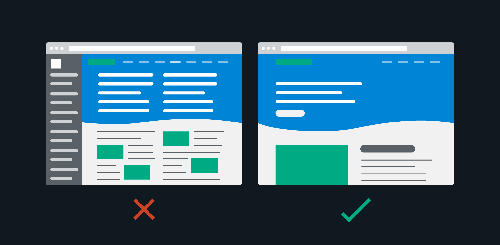
Hick’s Law states that the more choices presented to someone, the longer it will take them to make a decision.
Consider restaurant menus. It takes far less time to choose your dinner when there are only five entrees than if there are 25. The same rings true in web design.
When you limit the options and present relevant content at the right time in their user journey, you make it easy for them to focus and make a decision.
Landing pages help with this as they typically present one key message and CTA, effectively eliminating cognitive overload.
7. Use relevant visuals
Photos, illustrations, and icons amplify your message when they are relevant and paired with great copy.
Avoid using stock photos whenever possible – people are attracted to authenticity and many stock photos evoke just the opposite. When you do have to use them, choose wisely and customize them whenever possible.
8. Avoid carousels, sliders, and tabs
Don’t make key content difficult for users to find.
Although carousels, sliders and tabs can appear to add value by increasing the amount of content you can get on a page, research shows that most users won’t engage with much of it.
There are rare cases where carousels or sliders can be used without detriment to your message, such as showcasing testimonials. Because these are not part of your key offering, it doesn’t matter if the user only sees one testimonial or all of them. Although each one is unique and adds value, they all serve a similar purpose.
Contrast this with a page offering three different subscription options. If a slider is used and the user sees only the first option, they have missed out on two key offerings.
If you must use these components, keep the number of items to a minimum, ensure clear navigation, and make key content visible elsewhere on the page.
9. Leverage the fold
In web design, the fold refers to the bottom border of the page when it first loads. The content that is visible above the fold is prime real estate and should be used for high priority content and calls-to-action.
A 2018 study found that users spent “57% of their page-viewing time above the fold. 74% of the viewing time was spent in the first two screenfuls”.
Web users are quick to move on if they don’t find what they’re after, so it’s crucial to place your value proposition (the description of your key offering) and a clear call-to-action (CTA) above the fold. 
10. Leverage calls-to-action
A CTA highlights the action you want your user to take. Whether you’re a software as a service (SaaS) company with “Book a demo”, or a business development agency with “Book a call”, the CTA makes an available action clear to the user.
Your CTA button colour should be distinct from other colours on your site, and best practices dictate that it should be included above the fold, mid-page (when page length allows), and the bottom of the page.
11. Leverage social proof
Social proof is validation from a third party. It adds credibility and builds the user’s trust in your service or product. It also proves that you have solved this problem for other people before.
Social proof can be achieved in a variety of ways, including:
- Testimonials from satisfied customers
- Reviews
- Case studies (problem, solution, impact)
- Client logos
- Comments from current employees
- Awards
- Affiliations
- Certifications
- Mentions
When incorporating social proof, showcase measurable results whenever possible. For example, we helped Case Study Buddy get 233.76% growth in revenue post launch. The number speaks for itself.
12. Utilize social sharing buttons
The social icon links (Facebook, Instagram, Twitter) that you see in web page headers and footers are not social sharing buttons. They are links to your business’ social media pages.
A social sharing button is a link that allows the user to share your content directly to their social media feeds. For instance, a blog post with social sharing functionality allows the reader to share the post directly to their own LinkedIn page.
These sharing options make it easy for users to get your brand out there for the world to see.
13. Optimize forms
Forms, whether for the purpose of email sign ups, booking a call/demo, or purchasing a product, should include only relevant information. Don’t make it onerous, but leverage the opportunity to qualify leads.
Longer forms can be broken up into steps with visual guides (eg. progress bar). Back buttons are helpful in multi-step forms as well, allowing the user to go back and edit. Along those lines, adding labels to form fields can help users remember what information they’re filling in as they type. In some cases it may also be beneficial to include instructional text to give clarity to the questions being asked in your form.
For example, if you have a SaaS product that targets large businesses over startups, you may want to include a drop down menu that helps you qualify your leads by asking the user to select their business type. Then, by optimizing settings in your customer relationship management tool (CRM), you can prioritize qualified form submissions (large businesses) in your sales pipeline.
14. Site Speed
Slow page loading is a turn off. Users expect instant loading and if the page doesn’t deliver, they’re apt to go elsewhere.
Research has shown that 53% of users will leave a website if it takes longer than three seconds to load.
Slow site speed can be due to:
- Poorly developed website
- Increase in traffic
- Overloaded infrastructure on the back end
- Too many images
- Non-compressed/optimized images
Optimizing page speed not only increases user engagement with your site and brand, but it improves page ranking as Google factors speed into your search rank.
15. Optimize your site for mobile
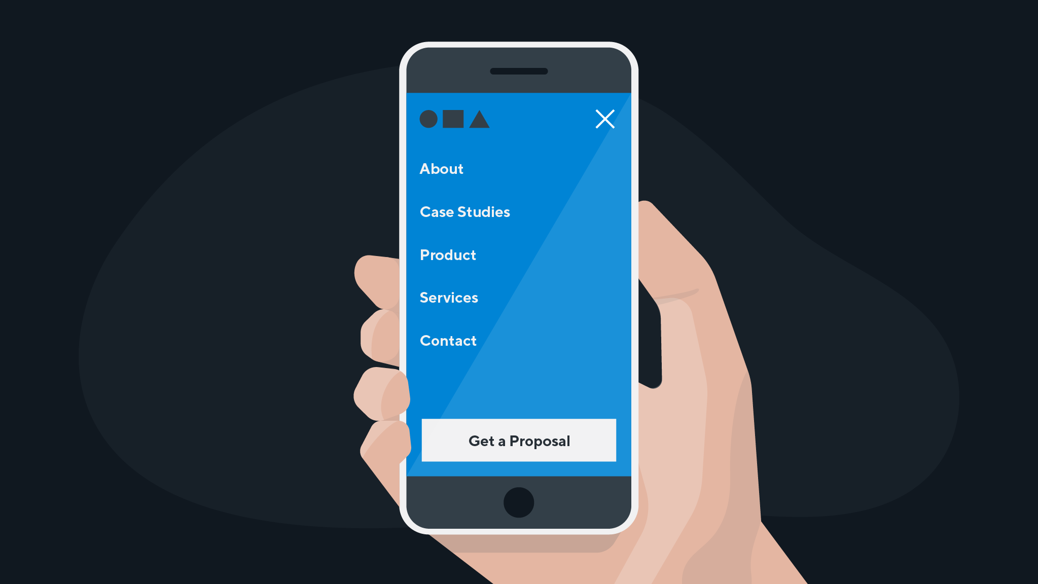
A thoughtful and strategic design process is required to optimize the user experience and clearly tell your story on all devices (mobile, tablet, and desktop).
Physical practicality is important for mobile web design, so consider where high-priority content is placed in relation to how a user holds a mobile device. Some design techniques, like menu hovers, cannot be used in mobile design, so make sure the mobile user experience does not rely on these for site navigation.
16. Be consistent
Consistent web design leads to familiarity and helps the user navigate your site with ease. For example, each item within a drop down menu should execute the same action. If one leads to an internal page, but another takes the user to a third party website, it creates confusion. Make the experience predictable.
Your colour choices should align with your brand and make site navigation easy. If you use blue for a CTA at the top of the page, use blue again at the bottom. Help the user quickly identify where they can take action.
Consistent application of typography provides clear content hierarchy, allowing the user to scan easily. Headlines should be larger and have more weight, whereas body text is smaller, and typically lighter weight.
17. Continue testing to improve user experience
Your website is an ongoing investment, so you can’t simply set it up and leave it. Continually gathering and reviewing data informs changes that should be made on the site.
Heatmapping (e.g. Hotjar, Crazy Egg) is a great tool to help you assess the effectiveness of your site. Here are a few pieces of data that heatmapping provides:
- Where users are clicking
- How far users are scrolling
- Where users are dropping off the form
This data directs your attention to problem areas on your website. Once you know the problem, you can address it through testing. For example, if you have a low click-rate on your CTA, try using A/B testing and change the colour or position of the button. Collect the data and then evaluate whether the change produced better results.
Just don’t change too many factors at one time or you’ll never know which change made the difference.
Expert web design is worth the investment
When you invest in your website, you are investing in a strategic asset designed to deliver to the goals of your business. Each of the elements we note above contributes to the quality and efficacy of your site. That means that each of the elements above can play a part in you landing new business, retaining existing business, and building your brand in the market. And while these web design tips are by no means an exhaustive list, they reinforce the value of expert web design in business success.
Whether you’re in the process of scaling your business or seeking to optimize your site and increase conversion rates, quality web design can get you there.
