Standards-based web design

What are web design standards? When you go to a website you expect the page to load in just a few seconds. That’s a standard. When you’re shopping on Amazon, you expect your shopping cart to be at the top right. That’s a standard too.
Standards-based web design isn’t a rule that says “You must do this”, but rather something that outlines what the majority is doing. Standards are best practices – “You should do this”.
Standards-based web design helps users:
- Know what to expect to see on a website (e.g. there should be a menu)
- Know where to find specific features (e.g. the shopping cart top right)
- Know how to engage with features on the page (e.g. click on the logo to return to the homepage)
The Nielson Norman Group says it well: “Users strongly expect standard elements to work a certain way when they visit a new site because that’s how things always work.”
Why you should care about web design standards
Web design standards make it easy for your customers to engage with your website – and by extension, your business. Sure, you want your website to feel unique and valuable, not a cookie-cutter website just like your competitors. But ultimately, you want your website to be intuitive and allow the user to focus on its key information.
Jakob Nielson of the Nielson Norman Group created a term called Jakob’s Law, which helps sum up the importance of designing with web standards. The law explains:
“Users spend most of their time on other sites. This means that users prefer your site to work the same way as all the other sites they already know. Design for patterns for which users are accustomed.”
The user experience (UX) of your website should be predictable and easy for your prospective customer. If it isn’t? Well, your prospect is likely to head to your competitor to find what they need. And it doesn’t take long for this to happen.
Research conducted by the Nielson Norman Group concluded that “users left websites after 1 minute and 49 seconds on average, concluding in that time that the website didn’t fulfill their needs.”
If you don’t want users abandoning your website to find something more familiar and easy to navigate, we suggest using standards-based web design. Based on our experience and pulse on web patterns, we’ve compiled a list of current web design standards and emerging design trends that will help you create an engaging website that turns prospects into customers.
What are web design standards of today?
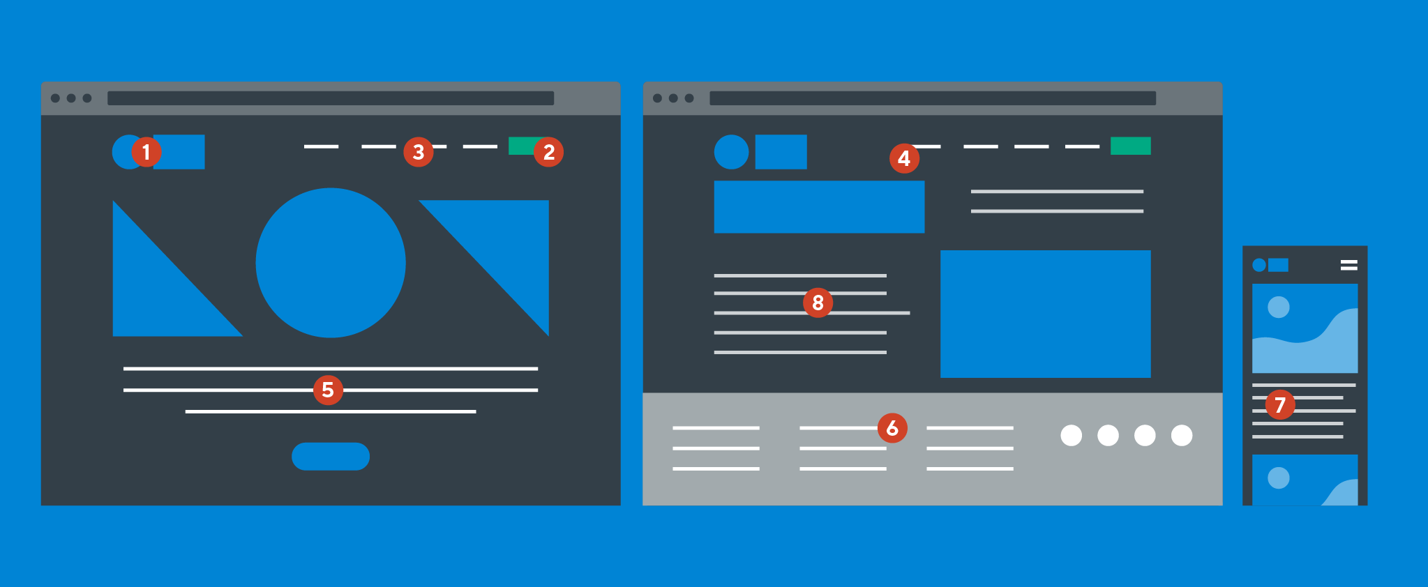
1. Logo top left
Your logo is an important landmark that tells the user whose website they are on. Standards-based web design recommends it be placed at the top left corner of the page. Why? Because we read in a “Z” pattern. So when we arrive on a page the top left is the first place we look.
We also know that this improves brand-recall. Research has also shown that 89% of users are more likely to recall logos placed at the top left of the page, rather than the top right.
Beyond placement, your logo should also return users to your homepage. Users can get lost in deep websites and often rely on clicking the logo to return to home base.
2. Call-to-action top right
A call-to-action (CTA) is a button that motivates prospective customers to convert (e.g. book a demo, get a proposal, register, etc). It should be simple, effective, and easily visible.
The most common CTA placement (and in our experience, the most effective) is in the top right corner of the page. Similar to the shopping cart, users often look to the top right when they’re ready to buy, or take action of any kind. When they’re ready to buy (or register, or sign up) they don’t have to think about where they need to go.
We frequently see websites choose to put a “Contact us” button in the top right corner. If the purpose of your website is to generate contact submissions, then this is a great strategy. But if your conversions are driven by registering or booking an appointment, or really any action other than customer contact, we recommend creating a separate contact page. Leverage the top right real estate for a conversion-focused CTA.
3. Main navigation across the top of the page
This might seem like a no-brainer, but standard web design principles recommend that your main navigation should be horizontal at the top of the page. Some websites will try to break the mold by putting primary navigation vertically along the side of the page, but this can be confusing for the user. Keep your primary navigation predictable.
4. Sticky navigation
Sticky navigation (or nav) means that the menu is accessible no matter where you are on the page – it scrolls with you. This web design standard continues to gain traction as users become more accustomed to scrolling for information (due to frequent mobile use) and less concerned about scrolling through long pages.
Stick navs can also be used for individual components such as tables, especially if the table contains many rows of data. With a sticky nav there’s no need to keep scrolling to the top of the table to reorient yourself.
5. Value proposition high above the fold
Your value proposition tells prospective customers about the solution you have for their problem and how their lives will be improved because of what you offer. It should be concise and easy to understand at a glance – visitors should be able to discern what it is that you do in under 5 seconds. And to do so, your value proposition must be in a high-visibility area.
6. Key information in the footer
Your footer is where users will go to find the information they haven’t found elsewhere on your site. If you have a high volume of pages, you might consider only listing the most important content in your main navigation, and then using the footer for additional pages.
Standards-based footers also include social media icons, contact details, privacy policy, terms of use, and copyright information. To learn more about what else to include in your footer, check out our blog post, 13 ways to optimize your website footer.
7. Responsive web design
Responsive web design is a method that optimizes page layout for all devices and delivers a seamless user experience on desktop, tablet, or mobile device. Web design statistics tell us that over 50% of internet traffic now comes from mobile devices, and that number is expected to grow exponentially over the next five years.
If your website isn’t already responsive, it’s time for you to upgrade. If not, you run the risk of users having a suboptimal experience with your website on their preferred device, and you could lose potential customers as a result.
In addition to maximizing conversions, responsive web design improves search engine optimization (SEO). When Google crawls your website it recognizes whether or not it’s responsive. Non-responsive websites receive poor rankings because they deliver poor user experiences. The repercussions of non-responsive will increase even more in September 2020 when Google begins mobile-first indexing. Google will crawl the mobile version of your website first and use it to determine your page ranking.
If you aren’t operating with responsive web design, Tiller’s responsive web design services can optimize your site for SEO and help you reach your audience on all devices.
8. Scannable content
Web users are scanners. They don’t read every word on the page and they certainly don’t examine every image or illustration in detail. Content that can be scanned is more easily and (quickly) digestible, so we always want to make sure that the most important information is prominently displayed.
Don’t overload your pages with content. Maintain a balance of white space and use a clear content hierarchy – first read this, then look at this, etc. Hierarchy can be achieved with typography (e.g. important headings are large and prominent in design) and directional design (e.g. subtle curves that draw the user down the page), to name just a few.
Web design trends for 2020 and beyond
Standards-based design is not intended to stifle creativity and individuality. If every website was the same and design trends never evolved, the internet would be a very boring place. Thankfully, trends break the rules and gradually morph into standards.
At Tiller, we prioritize designing with web standards. But we also love raising the bar and driving more value for our clients through creative web design.
Let’s take a look at seven design trends that are gaining traction on the web and see how your business can leverage trends to attract and retain more customers.
1. Personalization
The best way to connect with someone is to speak to them directly. Forbes recently reported that “34% of consumers are more likely to make an unplanned purchase if a brand personalizes content”.
We’re already somewhat accustomed to this. The default currency on eCommerce websites can change based on your IP address. Netflix delivers suggestions for content “Similar to” titles that you have already watched.
Deliver personalized experiences to your user and make it easy for them to engage with your business. An experienced agency with web design and development services can help guide you to the personalization strategy most suited for your business and industry.
2. Dark mode
No longer just a rebel iPhone setting, dark mode is a modern web design trend that brings design to life and makes your colours pop on the page.
There are specific reasons for which dark mode may be preferable:
- To minimize eye strain for developers – the colour coded syntax is easier to read on a dark background
- To showcase colourful design elements in an unexpected and dramatic way
- To highlight visual content with minimal text
- To promote a certain mood or environment (e.g. relaxing watching Netflix in a dimly lit room)
There are also cases where dark mode is not recommended:
- When there is a significant amount of text – light text on dark background may not be as legible
- When there is a lot of mixed content that is hard to contrast with colour schemes
- When design uses a wide variety of colours that may become overwhelming on a dark background
With time, we may start to see some of these use cases as more of a web design standard. But for now, if you’re not sure whether to incorporate dark mode in your web design, ask an experienced design agency.
3. Brand personality
Certain design elements like shapes, symbols, and other brand visuals can be incorporated throughout your website. This adds to the personality of your site and gives users a more immersive brand experience.
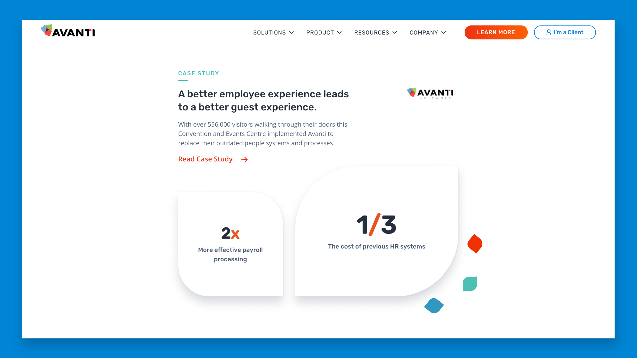
Using elements from the logo or brand visuals can be a great way to increase brand personality. For example, when Tiller designed Avanti’s website, we used shapes from their logo throughout the site – image shapes, flourishes in the background, and more.
4. Soft shadows and layering content
Web design used to be very 2D. Limitations in code technology meant that each design element had its place and they didn’t overlap. Now we add depth through shadows and layering content.
Soft shadows can be added to images, illustrations, and typography to give it a 3D feel. And overlapping text with images or background shapes adds interest to the design. Instead of flat and static the design becomes lighter and has the potential to add more depth and interest.
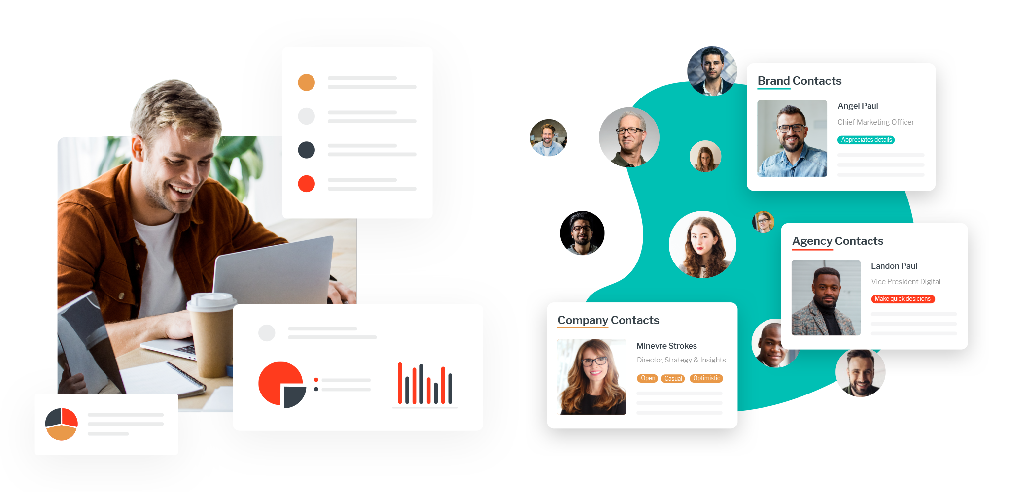
5. Mixing photography with vector graphics
Instead of choosing between photography or illustrations/graphics, use both. Incorporating illustrations into person-focused photography helps add personality to photos. This is an effective way to weave in brand visuals and add interest throughout your website. It also allows us to use visuals to tell more of a story. Custom details can be added to help visualize how a product or process works, in a way that a photo may not be able to on its own.
6. Minimalist navigation or mega menus
As mobile web usage has increased, so has the need for effective design with a streamlined focus, especially on a small screen. Minimalist navigation is more precise and doesn’t become overcrowded on smaller devices. Instead, it helps streamline navigation and prioritize key information the user needs to complete their journey.
On the opposite end of the spectrum is the mega menu – an equally valuable design trend. In a deep website, mega menus help users find what they’re looking for. They give businesses the opportunity to provide additional context and details that improve content navigation.
Mega menus are becoming increasingly popular with brands offering a variety of products and solutions. Instead of hunting through pages for links to other pages, customers can quickly locate their desired page in the menu.
Combine standards-based web design with current design trends to deliver outstanding user experiences
Without standards-based web design, the internet would be chaos and our users would have no consistent way to find the information they need. But if we don’t push the boundaries, websites will be dull, with nothing to make them distinct and captivating. User experiences would never improve. The way we consume digital content is constantly evolving, as are the opportunities to improve our delivery of web design. Pushing the boundaries leads us to more effective, more enjoyable web experiences.
Tiller has the experience you need in a web development and design agency – we pair visually stunning design with intuitive user experiences, to help your business achieve your goals.


