Slack: A brand audit of the company that reshaped the way we work

We all know that Slack is an awesome product. Often considered one of the best SaaS brands, Slack not only brings the right people, information, and tools together, it also makes work life simpler, more pleasant, and more productive.
At Tiller, it’s important that we invest in creating a positive work environment. One where connection, productivity, flexibility, and collaboration are the norm. Slack helps us do that, so what better company to select for a brand audit?
First, a bit of background
Slack is the fastest-growing SaaS startup in history. In just five short years, it has accomplished the seemingly impossible: Slack made work fun.
Slack was actually born out of a gaming company called Tiny Speck in Vancouver. Founder Stewart Butterfield and his team didn’t intentionally set out to create a SaaS Product for the workplace, instead, they wanted to create something new for the role-playing game market, a game called Glitch.
During the development of Glitch, Butterfield and his team craved better internal communication and collaboration. So they hacked together an internal tool called Linefeed to keep them in sync.
Tiny Speck’s initial product (Glitch) ultimately failed, but they realized that Linefeed was actually a pretty impressive communications tool. In 2012, Butterfield changed the name Linefeed to Slack, an acronym for “Searchable Log of All Conversation and Knowledge”.
Slack officially launched in February 2014 with a hashtag logo a tagline that read:
“Making work life simpler, more pleasant and more productive.”
The brand is more than a logo

From search to syncing, one-on-one conversations to group chats, Slack consistently lives out its mission, vision, and brand values.
Our culture turned inward creates our product; our culture turned outward creates our brand. Our brand is a reflection of who we are as a company and what we represent in the world of work. – Slack
Slack’s brand vision is to “create a world where organizations can achieve agility easily, no matter their size”. This brand vision is implemented through Slack’s brand values, which are:
- Empathy
- Courtesy
- Thriving
- Craftsmanship
- Playfulness
- Solidarity
Taking a look at the brand
What does the Slack logo represent? And how has it evolved?
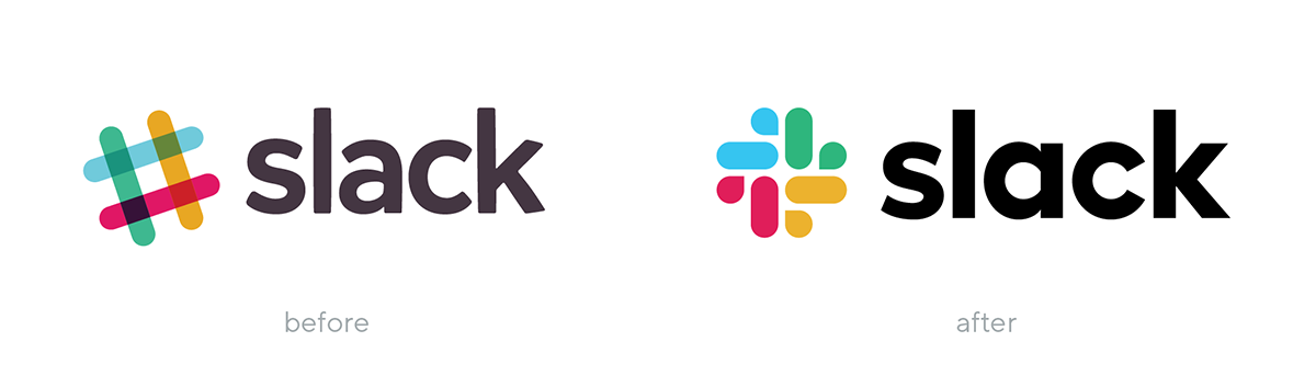
The first iteration of the Slack logo was created a while before the company launched. The octothorpe (pound sign or hashtag) was playful and distinctive. It showcased the character used to create channels within the product.
Prior to the Slack logo redesign, the logo used a total of 11 different colours, which apparently made it extremely difficult to use consistently.
Michael Bierut and the team from Pentagram worked together with Slack’s in-house design and brand team to design a cohesive visual identity that would capture the brand’s essence.
The familiar hashtag logo was updated with what is now only referred to as an octothorpe. The octothorpe is composed of simple geometric shapes that represent speech bubbles and lozenges. The Slack rebrand also brought the number of colours in the logo down to five.
What is the role of the colour palette?
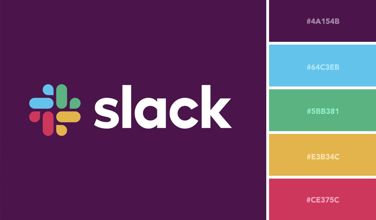
Slack’s colour palette accurately reflects their brand personality, often describe as “Creative, professional, thoughtful, respectful, purposeful and curious; we are smart, humble, hardworking and collaborative.”
How is the visual language applied to illustration and marketing materials?

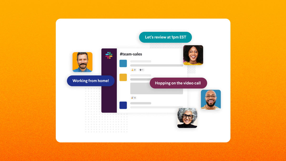
Slack’s illustration style is bold, elevated, and dimensional, and is heavily defined by the use of negative space and perspective. This unique illustration style captures the brand in a unique way making it very recognizable across all communications.
All marketing materials consistently apply Slack’s visual language to ensure the brand looks and feels cohesive no matter where it’s applied.
How is the Slack website experience?
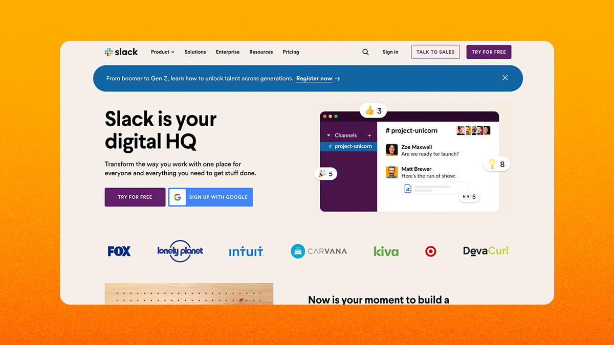
Although the website is packed with a ton of useful information and content showcasing the brand’s visual style and language, it feels a bit visually chaotic at times. There is a lack of cohesiveness when displaying all the logos from the different companies that use Slack.
Animations appear to have been thoughtfully applied throughout the website and add a nice touch to the user experience.
How is the product an extension of the brand?
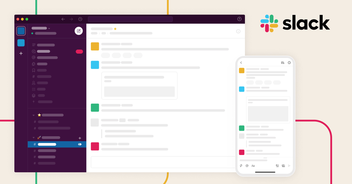
There is everything to love about the Slack application. It is easy to navigate, easy to use, delivering an excellent user experience. Slack has become one of the most used platforms for organizations of all sizes to communicate for a reason. The product is useful for teams and businesses across different disciplines and industries around the world.
Slack’s product interface is a seamless extension of the brand. The principles of simplicity, enjoyment, and productivity come through in the brand and in the product. It truly makes work communications simple and more streamlined, no matter where the user is or what device they’re using. In addition to fulfilling its brand strategy and living its brand values, it also gives users the ability to customize all kinds of settings and even create custom emojis.
Conclusion
I personally love Slack! It is a well-recognized brand that is consistent and cohesive. Is a brand that lives their core values. Moreover, the product is very relatable to the work environment, yet playful through the application of colour and visual language.
To summarize this brand audit, Slack is really an amazing example of the greatness that can come out of failure (sorry Glitch!). In my opinion, Slack is truly the sum of its parts and a brand to admire and aspire to be like.


